
Mona for Mastodon App icon(s)

Mona for Mastodon (iOS, iPadOS, and macOS) is one of the most versatile and customisable applications to access the Mastodon platform. So customisable, it reminds me of the Apple slogan: “there’s an app for that” – there’s virtually a setting for that on Mona for Mastodon for a personalised tailor-made experience. I love this app so much that I created a dedicated account on Mastodon to share some custom themes I made for Mona.
I intended to write an in-depth review ready for the official launch but never finished it on time, so I may rework it as a ‘review/how I use Mona’. Meanwhile, you can read some excellent reviews of the app on MacStories, Devon Dundee and a very handy video walkthrough from A Better Computer.
For those that may not be familiar, Mona for Mastodon is a direct port of Spring for Twitter, reworked to serve Mastodon and the ActivityPub. I was on the TestFlight beta throughout its journey under development. I witnessed the incredible work put into making it a fitting experience for Mastodon. I wholeheartedly respect and applaud the talent behind the app, and I don’t have much to criticise.
However, as a long-time user for several years since Spring for Twitter, I noticed a large section of the user-base has always been baffled by the app icon; it is not an app icon that immediately springs (pun intended) out to you as a Twitter application given all the existing popular Twitter apps with bird references on the App Store.
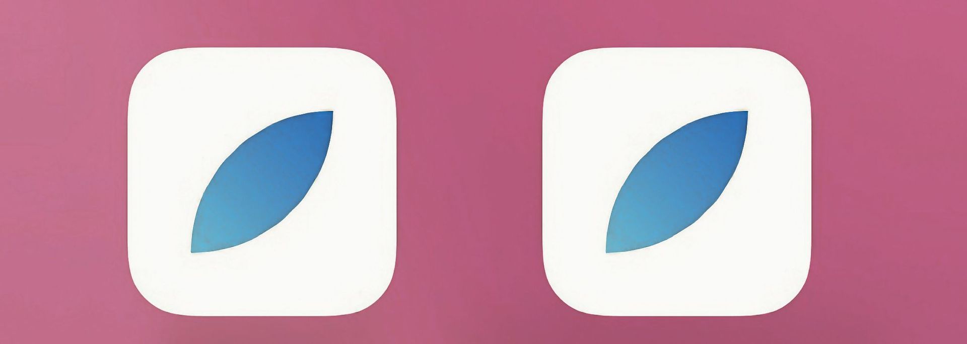
The Spring app icon, used during the Mona TestFlight beta, which at the time, I thought was a placeholder, expecting Mona for Mastodon to debut with a unique, more fitting app icon for Mastodon. Alas, this was not to be. The app icon remains one of the most unfitting aspects of Mona, in my opinion.
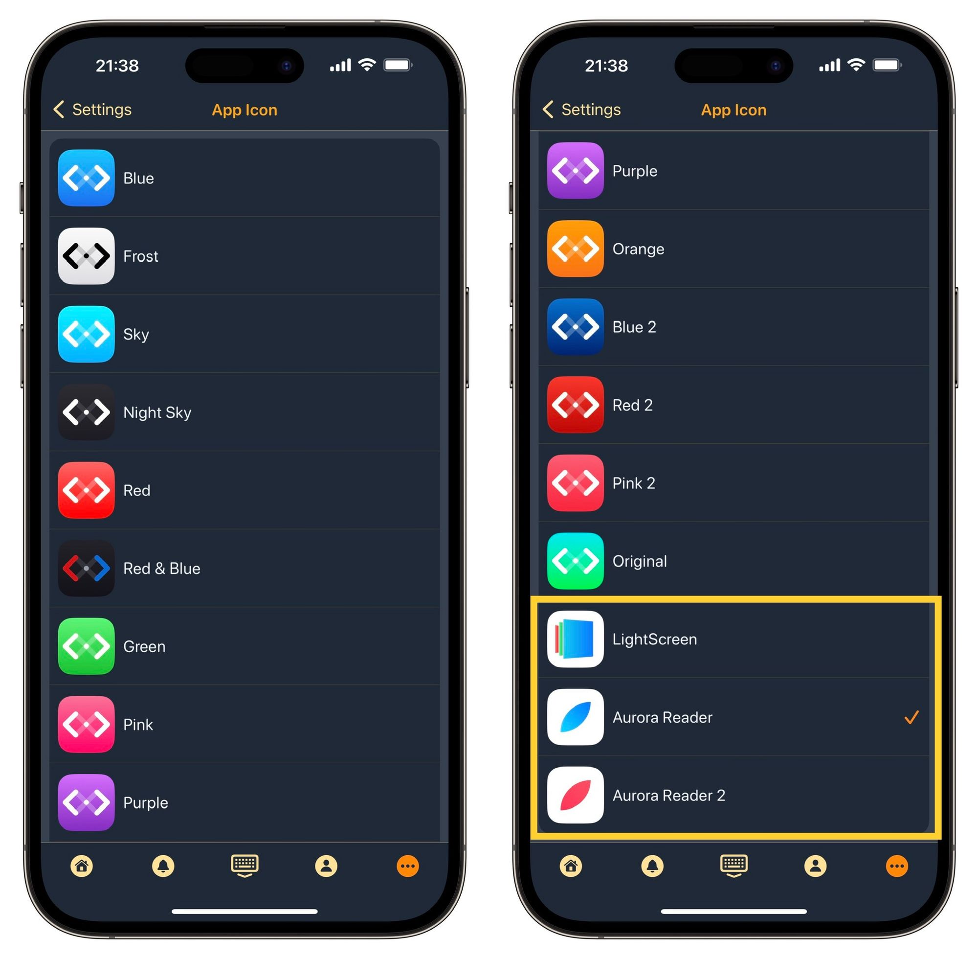
Mona for Mastodon recently got updated to version 5.2 with the addition of three alternative app icons. I can almost visualise the animated googly cartoon eyes on users' faces when they read that line on the App Store update notes. I now dread to think about the possible expletives some may have uttered when they realised what the ‘alternative’ app icons were!
In what I can only personally describe as bizarre, the alternative app icons offered on Mona are the same app icons used for the developers’ other active apps on the App Store: Aurora Reader and LightScreen. I do not recall ever seeing such a move adopted by a developer, at least not between any of the applications I have used from the same developer.
I understand and respect the developer likes and prefers the existing icons and wishes to keep them. I get that, completely valid, and he is within his right. It wouldn't have hurt to look after your loyal customer base who adoringly evangelises your app. Offer them an entirely different, much better representation for a Mastodon app icon(s) as an additional extra to the already existing ‘Spring’ app icons. As the saying goes: kill two birds with one stone; you get to keep the existing Spring icon set you to want to represent the app, the user-base gets to have decent alternatives they prefer to see on their Home Screens.
Offering an icon set already used on your other active apps on the App Store is not the best approach to appease your users' requests for alternative app icons.
Now, you might think, what is the big deal? It’s just an app icon.
To which I reply:
To help users understand what function your app serves, it needs to communicate the essence of the service through the icon of the app.
I love this app. I will keep using it alongside other Mastodon apps in my library, whilst I continue to long for a Mona app icon that will evoke such feelings.
No spam, no sharing to third party. Only you and me.